How do you determine if a trend is used poorly? Empathy and intuition. Consult your inner jiminy cricket. Would you like it if someone did this to you with their website? If the answer is no, perhaps you should forgo the fifty pop-ups even though you ‘got so many newsletter sign-ups’ that you can spam them for the rest of your life.
Does it work? Congratulations you converted 5 more people and pissed of another 40, ruining your brand perception and making them re-consider ever clicking on your self-congratulatory content again. So yes, you guessed it my number one example of a web design trend used poorly is:
1. Invasive pop-ups, the kind that you can’t figure out how to close or that force you to answer a ridiculous question.

How to do it better – Give something of value away when someone is leaving
Instead of trying to push somebody into you e-mail list, pull. If you’re giving me something of value I’m not upset that you put a big old pop-up in my face, in fact I might be a little intrigued. What’s important to note, is that the content is the variable. Don’t dust of some shitty white-paper, build something great – work with a team to build something great – whatever you have to do and then make that the centerpiece. Pair that with an ‘exit-intent’ pop-up and don’t force anybody to make a decision – always give clear ways to x the pop up out.

2. Infinite Scroll because fuck it man, we don’t need a clear call to action at the end or a beautiful footer with well thought out navigation

Maybe this is an example of my cynical old man brain, because I can’t even handle when twitter changes from stars to hearts – but if we’re applying the golden rule here, I hate finishing an article and having someone else make a choice about what article I want to read next. Making the decision for them might be pleasant with facebook and youtube videos because hey, it’s video and I’m just vegging out anyway – but for content you have to read, I’m sorry I don’t think you’re going to make a decision about my preferences accurately based on one article or piece of content I finished.
I’ll caveat this with the fact that gallery type / Pinterest-esque sites where you’re browsing an array of items seem to have some benefit to this type of navigation, but it may be limited to social. The rest of us need the satisfaction of a conclusion and more navigation.

How to do it better – Think about what a person would want to do after reading type this category or type of content on the site.
Each type of content on the site can have a type of pre-footer with other similar articles, navigation elements and ideally a couple clear next steps tailored to what they just finished. As much as I hate the ‘Lobster’ font in the above example (Messages Home), I think that Jared thought long and hard about what people might be interested in after they finished reading a page of content and shared those in a visual way that is clear and simple. If only other footers were so lucky. I’ll admit it, I have a footer fetish.
3. Painfully distracting Parallax that adds no value except for one millisecond of oooh-ahhh.
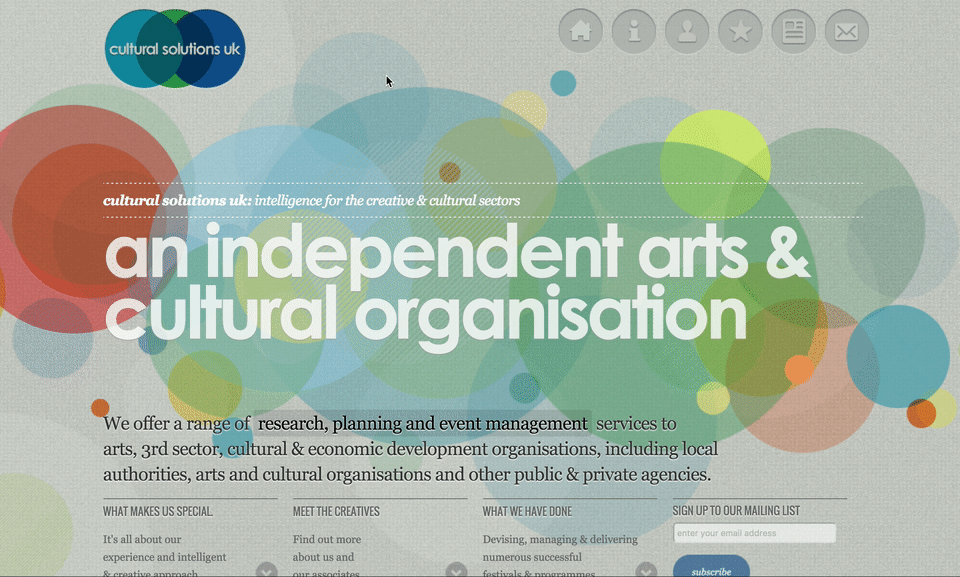
This arts and cultural organization has movement, it has depth – but does it have meaning? I can’t imagine how the circles in the back add any useful element except for at one point it was original, or not done a lot yet. I.E. a gimmick – but hey they won a site award… so the site must be good right?
Movement and depth can be great when tastefully implemented, unfortunately a large number of people rushed in to implement parallax without a lot of thoughtful intent on how it would really help visitors and add value. Big spacy designs are beautiful but if you’re trying to get to the meat of a website’s content and really learn about how or why you’d want to work with a company or buy a product – lengthy parallax sites miss the point.
How to do it better – Implement subtly to add some depth and use sparingly in a way that adds a bit of intrigue for products when appropriate.
By now, perhaps many of you have seen The New York Times Snow Fall Article which was published in 2012. The article uses parallax and video in a way that was almost disarming because it was so progressive at the time.
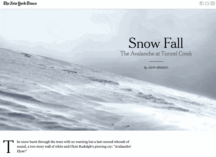
Keys that make this site work so beautiful?
- Strong emphasis on the content – typographic elements are super well thought out and readable
- Title treatments give clear hierarchy
- All of this plays together quite nicely so that the parallax aspect isn’t center stage, but rather a pleasant subtle piece to a bigger picture.
Which is exactly how parallax can be used tastefully in 2016, without feeling like a gimmick.