I’ve had people express interest in starting to hand-letter but didn’t know how to start. I’m happy to present this crash course in hand-lettering! In addition to Minneapolis web design, and Minneapolis SEO I’ve been hand-lettering now for about 6 months quite vigorously. I’ve gathered beginner hand-lettering tips and tools for those looking for how to get into hand-lettering in this in-depth article.

+ 50 Examples of Hand-lettering and what they can teach you
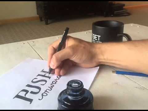
Hand-lettering for beginners: let’s get it on!

I spent time in copying fonts and then trying to reproduce them from memory, becoming acquainted with their nuances and being directly inspired by people’s work on Dribbble and Instagram and have grown a deep and meaningful love for the hand-written word. Getting into hand-lettering has been a blast, and it reconnects me to life because of it’s physicality when a lot of what I do is in the digital space. Don’t get me wrong, I love creating a good website but it helps to be exercising my creative instincts on pen and paper in a different and seemingly more primal way.
1. Get really into fonts, and copy them, becoming deeply acquainted with different genres their characteristics.
If you are a graphic designer there’s nothing like soaking up your favorite font. This exercise involves copying your font over and over again until you absorb it’s essential attributes and an understanding of them into your style and practice.
Mini Lesson #1: Getting started with hand-lettering pen to paper
- First use tracing paper to copy your favorite font detail for detail soaking up the main characteristics.
- Then copy it by looking at it, but not tracing.
- Then try to reproduce it from memory,
- Afterwards go back and look at how you could improve. Making notes on what didn’t match.
Rinse and repeat with another font, perhaps a different genre of font. If you just did a serif font, try doing it with a script font. Don’t forget to do both uppercase and lowercase.
If you need some templates for hand-lettering fonts for beginners to trace. I made PDF’s of 9 fonts so you can get started tracing immediately. Check them out here
Quick tip: Space between letters
While concocting your hand-lettering composition, make sure you pay attention to the space between letters. Its should be about the same space for each, if you filled the space with fluid. Don’t count deep bowls within letters as part of that ‘fluid fill’ general rule, just any superficial crevices.
2. Follow the best of the best and don’t be afraid to spend some money on tutorials and resources.
You don’t have to spend an arm and a leg to become a better letterer, but I’m not going to tell you it doesn’t help. Sometimes you get what you pay for when it comes to tutorials. That being said, you have to accompany whatever tutorials you read with vigorous intentional practice. It’s that practice, time and attention that’s going to really set you ahead of the pack.
– Here are some amazing resources for tuturials and instructive articles.
Resources:
- Typedia: A community website to classify typefaces and educate people about them.
- Stephen Coles Answers to Type Questions: 9 pages of Stephen’s answers to your burning questions about type.
- Sean McCabe’s Podcast: Sean McCabe is not only a master letterer but an ambitious entrepreneur who shares the things he’s learning related to selling products, e-mail lists, and marketing on the web. His podcast is delightful.
- Sean McCabe’s recommended tools: Sean suggests tools are not magic, but here are his favorites.
- A Tutorial in Hand-lettering: This tutorial shows how you can utilize guides to get a intentional slant to a script lettering piece.
Mini-Lesson #2: Knocking out a white background from a hand-lettering piece in Photoshop
-
- Open your image with the white background, or paste your lettering piece into your photoshop document.
- Make a layer and use the paint bucket tool to fill it totally with dark grey, and place it behind the layer you are removing the white background from.
- Find the fx button at the bottom of the Layers panel and choose Blending Options.
- A box will pop up and on the bottom you’ll see two pairs of sliders. Each of these sliders lets you make parts of your image transparent based on the brightness value of the pixels. For this mini-lesson you’ll tweak the ‘This Layer’ slider.

- If you want to hide a white background, drag the highlight slider (the one on the right) toward the middle until the white part is transparent.
- As you drag, you’ll see the white areas of the image disappear and the dark grey background will appear. Note that any white area will disappear so be conscious of how far you drag.
Quick tip:
Sketch the composition loosely a lot first. Sketch your layout over and over, paying attention to what words would be appropriate to emphasize. Find a rhythm and a flow to the letters, looking for ways to creatively have them ‘respond’ to each other’s shapes.
A couple posts about process and resources I’ve shared on my site:
- Seeds: The process of creating this hand-lettering piece
- New Years, New Digs: Process shots.
- 5 Best Hand-lettering fonts: Even though these are fonts, they are often derivative of hand-lettering work and can give you a great idea of some styles.
- 10 Examples of Hand-lettering I Want to Inspire My Work
In the end, if design is your business, your hand-lettering is another way to spread the awareness of your business to the general public, attract new clients, and make new connections.
– Here are some tools to buy that can help amp up your hand-lettering game/style.
- Sean McCabe’s Learn Lettering: This course is a bit pricey, but if you do what it instructs, well worth it. – $299
- The First Steps of Hand-Lettering: Concept to Sketch (Lettering I): This course takes it from a different angle and is offered by Skillshare. – $10 bucks a month for Skillshare
- 30 Days To Better Hand-Lettering by Made Vibrant: 30 Day E-course with 6 lessons, 9 videos, and 30 days of prompts for hand-lettering exercises. – $20
- Lettercraft: Awesome tool to get that great texture for your letters quickly and easily once you have your piece in photoshop. Drop in your design as it instructs and it will apply the textures you’d like. -$19
- Retrosauce – LetterPress Actions: I have not tried this, but it is made by the creator of Lettercraft and could be used for some different styles. – $12
Mini-Lesson #3: How to choose the right tools for hand-lettering.
- First of all, fancy tools are not necessary. Get started with your favorite pen, whatever it be. Once you have a couple tries under your belt and really think you are going to keep going – do a little shopping, but consider starting with these basic tools.
- Sakura 30062 6-Piece Pigma Micron Ink Pen Set, Black – Buy on Amazon
These radical pens can be used for outlines, and the thicker ones for filling in. They are versatile and are the pens of choice for many letterers, as well as being iconic. - Basic transparent protractor – Buy on Amazon
Sometimes you want to build your hand-lettering piece on a basis of order. A simple ruler or protractor will allow you to do this. No need to get anything more complicated than this, off the bat. - Lead holder – Buy on Amazon
Basically a fancy-ass mechanical pencil. But rather than have little skinny lead that breaks easy and pushes the paper in like chicken scratches you can use different darknesses of lead, and the lead can be thicker and stronger. - Tombow Fudenosuke Brush Pen, Twin Tip, Black/Grey – Buy on Amazon
This thing is great for making two tone compositions. For my ‘Solidarity’ Hand-lettering piece, I used the two-tone aspect, then used illustrator to live trace it, and changed the lighter grey to be yellow. Tombow’s have a different flow to them and can give you some of that messy brush look, or be used to fill in letters a little more quickly. - I use basic computer paper, I don’t think much else is necessary. If you want to get some textured paper for a particular style you are going for, by all means, go for it.
Quick tip:
Use contrasting type styles for words, but not too many!I find it useful to choose contrasting kinds of type. A skinny script goes great with nice chunky sans-serif font. Small type looks great next to big type, and even if you’re using two sans-serif types of type, contrasting the ‘weight’ or thickness of font can give you nice effect when they’re placed next to each other. I think it’s best to have 2 or at most 3 to start off and make sure you master ‘the art of a few’ pretty well, before trying to move on to more. Personally I use this as a general principle for many design projects, not just lettering.
– People to follow on Instagram that do great hand-lettering work.
- Mister Doodle for a tight, technical, flowing illustrative style: @misterdoodle on Instagram
- Nick Fred for a classy, hipster, rough texture: @nick_fred on Instagram
- Sean McCabe again for tight, technical clean work: @seanwes on Instagram
- Decks for crusty bad-ass, motorcycle, tattoo style @deckysastra on Instagram
- Chezmeka a punk, cartoonish, and bold style @chezmeka on Instagram
- The curated best on Instagram @goodtype on Instagram, @thedailytype on Instagram, @handmadefont on Instagram
-Ways hand-lettering has connected me to people:
- I’ve connected on Twitter to influencers in marketing and been able to meet up in the real world with them and offer them hand-lettering as tool for their tool belt if they’d like me to do some for their blog-posts.
- Created branding for non-profit projects and am able to connect with a broader audience through doing real world projects for people. Mind you, this is all 6 months in to what seems like it will be a longer process going into the future.
3. Places to get involved with the hand-lettering community
- Reddit / Lettering: A great place to have discussions on and get feedback on designs.
- Dribbble: The best of the best designers show off here. Look for lettering here to inspire you.
- Pinterest: Since this is such a visual social media platform, you can catch a ton of great stuff on here.
4. Set up a goal for yourself to deliberately practice hand-lettering consistently
Nothing can be mastered with that particularly effective element of consistent practice. Start small and give yourself a week to hand-letter every day, looking into some of these tutorials each day to really deliberately hone your skills. Try drawing in the style of one of the people that is crazy excellent and coming up with a distinctive concept that is interesting to you so that you can get excited and channel that enthusiasm into the piece.
Bonus Round: Hand-letter every day for 365 days
There are a number of people doing this on instagram, check out the various hashtags, #365series, #365daysoftype, the hashtag I started for my 365 day series #minnetype and the one that I was inspired by Nick Fred’s #omatype. It’s interesting what consistent effort sustained over a long period of time can do when it’s deliberate and focused. Hard work and time are the magic ingredients for anyone in the pursuit of a creative skill.
50 Examples of Hand-Lettering and What They Can Teach You
1. “December” thin script – Found this one on pinterest, and the look feels relaxed and yet sophisticated. To me, these looks require a close study of the lettering at hand, some letters are bigger and some are smaller. As you notice the e doesn’t flow seamlessly into the c, it stops. This along with the tight D with a giant flourish makes this design feel very interesting.

2.”Brush” script lettering – Jadanuk on Instagram drops that thick and thin, very relaxed hand-lettering. Achieve the look with practicing brushed tight curves, and you may have to take 20-50 stabs at it before you get the one you like. Take a look at Jadanuk’s Tumblr website for more work.

3. “Good Times” by Simon Walker. Follow him on Instagram, or check out his website for more. Brilliant use of flourishes to provide visual balance. This kind of natural control takes quite a bit practice, as flourishes are not easy to make look right.

4. “Choose to See The Good Stuff” by Tim Bontan – His Instagram & Website. Love the sentiment here. I curate the best of the best for myself to make sure I’m holding myself to a high standard as I try to get better. The small script within the larger and swashy script is great, not to mention the use of objects to give the viewer a sense of scale and the physical space. Photographic sensibility is a huge part of how your final lettering composition looks on social.

5. “Take the Next Step” by Dan Lee, or dandrawnwords on Instagram. Thick and thin lines with rough edges, angled and juxtaposed with a simple san-serif in “the.”

6. “Friday” Thick, blocky script by Colin Tierney or tierneystudio on Instagram. This style is ridiculously fresh. Clearly the non-chalant feel of this requires alot of practice and a touch of a dry pen for the texture. Achieve the look with thick down strokes and mostly thin left to right connections, besides the strokes that don’t connect and underline, or long flourish.

7. “Goal Digger” by Jenny Highsmith, jennyhighsmith on Instagram, the watercolor look is fresh. I also love the descenders on the g’s going down together parallel and the friendly, cute look is hard for me to achieve, but the width of the thick strokes vary.

8. “Here’s to the Crazy One’s” – Not really sure how this was created, but clearly creator Luke Choice, or velvetspectrum on Instagram has his own brilliantly unique style. The strength of color without feeling forced that Luke wields is distinctly impressive.

9. “Lest We Forget” by Blush Creative Studio ( blushcreativestudio on Instagram) – I’m a pretty huge fan of greyscale, partly because it’s alot easier to create something that is striking and not tacky. This beautiful, relaxed example is a lovely example of lettering that could be done in 5 minutes (if you’ve practiced a lot previously.)

10. “Save me, O God.” Judedias on Instagram, buy his designs on Casetify. Maybe you’re starting to see my appreciation for these angled shots up and to the right? Clearly a rough touch on a thin brush allows for these kinds of lines. The balance of hard lines and thin connecting lines takes practice, and discretion as there are some conventions, but a certain amount of choice on where they go. Generally, the rule is downward strokes are thick and upward strokes are thinner.

11. “Shit Happens” by Paul Von Excite Check him out on Instagram. This work has clearly been worked and re-worked, to me it’s an example of very polished, extremely clean hand-lettering.

12. “Worth My Salt” by Spilenka – Instagram. Not only is this lettering piece made of salt, but it’s piled with intentional peaks in the middle of letters giving a 3d feel. Sketch on paper lightly and then arrange objects / salt / other over the top. This example in particular requires a delicate and intensive touch.

13. “Lettering” – Colin Tierney – Instagram. Love these shots where it shows the designer’s notes to themselves as they perfect a design.

14. “Draw” – Colin Tierney – Instagram. Notes to himself on this one include checking the letterform width. This is something I pay attention to when the letters are intended to not be variable width, getting the letters consistent in width in this case gives a much more solid look that makes the piece feel stronger.

15. “The Lone Bellow” – Jeff Rogers – Instagram. There’s something about scale that you can leverage to create an impression, in this pencil sketch Jeff Rogers shows how practice can make even small compositions create a sweet look.

16. “Traditionally Crafted and Tastefully Fragrant” – Neil Secretario on Instagram. Using long lines above and below a curving set of uppercase letters creates a horizontal flow.

17. Wander Lust – This design utilizes a simple illustrated arrow and flourishes that intertwine. Try breaking the flourish to create the look of a shadow underneath the overlap and give a bit of depth while overall retaining a flat design.

18. “Wise Men” by Danna Cassaro, on Instagram- A sleek combination of 2 letters requires experimentation. This example utilizes the natural arc of the letters and extends them, so they work into each other.

19. “A Life long Love Affair” – The glue, or substance used here gives a little shadow and provides an interesting look, but taking this direction it would be good to layout the composition before hand until you have an idea of how it will balance out and your style first.

20. “A Negative Mind Will Never Give You a Positive Life” – This design displays how changing up your tool can force you to try a different style.
[bctt tweet=”“Diversifying your tools can help you add more variation within your styles””]

21. “Adventure is out there” – I highly suggest when adding color to your compositions to keep it simple. This example shows an example of green and gold used tastefully together. I also love the look with the “rays of light” illustrated out. Achieve this look with simple dashed lines evenly spaced from each other all around the design or element within the design.

22. “Aim High.” This composition utilizes a simple illustration as the “I” in the word aim. My pattern in lettering is taking two complimentary but distinctly unique types of typography and pairing them together. In this case the letters of the sans-serif “Aim” are the same thickness as the script “high.”

23. “Badge & Gun” – Sophia Slater – sslater6 on Instagram. I love the rough, quick feel of this composition. The scribbly element strikes me as calling to mind alot of the things I love about hand-lettering. It feels natural and requires a instinctive trust of the hand and understanding of letterforms. Sometimes the more highly polished lettering compositions feel less like hand-lettering to me and more like something else.
![]()
24. “Beauty” – White letters on a dark background can be a nice change up. Get a white paint pen to achieve this look and try it out on a wood box from a thrift store, a map from an antique store, or gold/bronze construction board as pictured here.

25. “Bigfoot” – Not sure the actual medium here, but it feels like chalk or colored pencil. Achieve the look by taking a high-fidelity picture or scan of the letters and preserving the natural texture, and matching the lettering design with a photograph that has a similar texture in the landscape or objects pictured. Interweve the letters with some of the elements in the picture for a more integrated feel.

26. “Born & Raised” – Sophia Slater – sslater6 on Instagram . Once again with this scratchy, vibrant, organic look. Achieve the look by going quick and removing curves and only retaining hard angles, and allowing pockets of white within the letters and not filling them in. Love the black and white with just one red element to make it interesting.
27. “Build Rapport” – Once again script font with a blocky sans-serif , contained within a water-colored illustration. Use a brush pen with watered down Sumi ink to achieve the shadows in the wrench on this one.

28. “Bury the Past” hand-lettering by Scott Biersack (youbringfire on Instagram.) Amazingly informative tutorial can be found here. First you brainstorm possible things to letter, choose one and sketch out 10-20 layouts with emphasis etc. Scott suggests doing the light lines of the letters first and then building up the thickness of elements after you have the underlying lines. Adding weight to light lines and making adjustments from there has helped alot of my compositions.

29. “Cigaloo” by Wells Collins – On Instagram. Love the deep texturing on this design. Acheive this look by very intentionally adding textures into the broader down strokes of crisply composed serif.

30. “Citizen of Heaven” by Fred Sprinkle – On Instagram. I think this kind of look can be worked on by experimenting with angles in your letters. The shrinking up to the right of the top letters and the enlarging of the letters up to the right on bottom provides visual interest.

31. Crypozoology by Aiden Guinnip – on Instagram. Love the geometric feel here. Try drawing a badge-like shape and then fitting the word inside. In this case Aiden forgoes big curves for hard angles.

32. “Dashag” by Gert Van Duinen – on Instagram. Achieve this look by experimenting with big swashy flourishes that comfortably circle around the outside of letters. One little spike/bump comes out of the “s” giving the letters just a touch of edge.

33. “Dead Sexy” by myself (@timishness on Instagram.) The Slabby tall letters juxtapose with the flowy script font below. Achieve the look by experimenting with the scale as well between the words. The composition is also heightened by the strong contrast between the letters and the background; I like to put a black overlay over a photograph and turn it’s opacity to 70 or 80 percent in photoshop.

34. Depths by Alexander Weston – on Instagram. Radical flat animal illustrations with lettering inside. Not sure I’ll ever get bored with this trend. The letters in this example echo the anchors long body and strong angles.

35. Designer is a Diagnosis – Alright I’m partly featuring this one for the mix between watercolor and lettering. The artfulness here, the message many of us can relate to, and the combination of elements makes this a great example.

36. “Eat My Dust” by Paul Von Excite – on Instagram. I actually appreciate that it looks like Paul used a font as the basis for “My” in this piece. A client receiving this lettering work wouldn’t care as much that it’s based on a font, as much as other letterers might. From Paul’s tutorial I noticed he comes up with some keywords to help guide his process on this one. He used “Swooshes, a lot of swooshes, elegant, nice tails, italic and slightly tilted,” as words that guided his process on this.

37. “Every Cloud Has a Silver Lining” – Speaking of swooshes; I’ve never quite mastered the art here, but the key to this piece’s success is asymmetry and using the swooshes to create a shape around the lettering composition.

38. “Forever I love Atlanta” – Once again Shadows are being made be gaps in the white.

39. “Frame” – Love the use of geometric pattern. Achieve the look by studying molecule models, and creating a lettering composition within the illustration.

40. “Future Islands” – Jonathan Faust – on Instagram. Thin, thick and lot’s of clean up, this piece benefits not only from the juxtaposition of the thin sans-serif on the bottom of the script, but the delicious alternative look of the F, and the use of color in the composition of the photograph – like I’ve mentioned, the photograph is part of the art.

41. “Glue” – on Instagram. Achieve this look by of course using some kind of viscous liquid to get dimension, but also taking two swashes on either the top or the bottom of the word and swirling them into each other without having them touch. 
42. “Hachike” on Instagram. Taking on an almost arabic or asian influence, the curvy, script influenced serifs on this design fit into each other like lego’s. This requires a ton of intention, and to duplicate the look you may need to have the right word to achieve the interconnectedness displayed here. Sometimes I change the word I’m trying to letter to get the right letters and right look.

43. “Handtype” by Andy Lethbridge – on Instagram. Andy used a Tombow Dual Brush Pen to create very precise look here. To achieve this look use thick down-strokes, light up strokes, and a long cross on the t with a flair up and flair down. Clearly a lot of iteration and understanding also that went into this composition, Andy is extremely talented.

44. “Harvest Salted Almonds” – Lovely use of texture and dusty, pastel color here. 
45.”Hawaii – Pacific Island Style” – The Process shot here is deeply inspiring, from the clear difference between the 3 lettering styles, the mix in of the flower illustration, or the gorgeous balance in the composition, the take-away here to me is perhaps the use of flourishes to fill in gaps when it makes sense.

46. “Hawkes and Dumar Branding Exploration” – To me, I just get so inspired by the sheer amount of radical options here for branding. To achieve this style, don’t clean your letters so much that you remove any rough edges. Look at the one on 1968. The right edge is almost purposefully rough, and to me it adds character to the the design; don’t sanitize your drawings so much people can’t tell they’re hand-lettered.

47. “Hawkes and Dumar” – another example of this great branding work.

48. “Hungry” – I’m particularly proud of the chunky letters on this one, and finding ways to make connections that wouldn’t otherwise be obvious. When and where to add swashes to your hand-lettering pieces is a matter of taste, restraint and spontaneity. Read this section of Calligraphy for idiots for guides on where and when to add or not add swashes to your hand-lettering pieces.

49. “Hungry for Adventure” food lettering, Danielle Evans on Instagram. I love the way working with food and letters opens you up to the physical elements we come across everyday. So many opportunities to create. The key to these pieces is allowing yourself a small space to work with so you create it with a delicate touch.

50. “Tokyo, Japan” – Jonathan Faust on Instagram. What do you get when you wield a tall sans-serif with a big swooping Script font? A very striking piece. Once again that upward slant, with downward sweeping curves, to achieve this look, you’ll need a lot of revisions. 🙂

Ten Hand-lettering Courses to Jumpstart You
1. Learn Lettering by Sean Wes
To be clear, this is the one that jump-started me into the world of lettering. A bit on the pricey side, but clearly the industry standard at the moment, since Sean is likely the most well-known on hand-letterers at the moment. Followed quickly by the ridiculous dude who made this video, Seb Lester.

2. Logo Lettering – Hand Letter an Effective Logotype From Sketch to Vector by Nicolas Fredrickson
Wait a second, did I say the last guy helped jumpstart my hand-lettering work? I meant Nicolas Fredrickson who started the #omatype hashtag on Instagram and threw up some of the most bad-ass logos and hand-lettered designs. He’s since told me that I should check out the people he’s following on Instagram and follow them too, and I did just that. I followed every last one of them, so many of whom have incredible work in the same vein as Nicolas. Check out this course through Skillshare and you’re going to get to the next level in your lettering skills.
3. The First Steps of Hand-Lettering: Concept to Sketch (Lettering I) by Mary Kate McDevitt
A prolific hand-letterer out of Brooklyn, New York shares her space and her skills. This two-hour course culminates with a class project of hand-lettering your favorite phrase.
4. Crash Course to Hand-lettering by Tim Brown (Yours truly)
My crash course to hand-lettering is on the shorter side of these courses, but you can find several mini-lessons throughout and I share with you some methods for longer practice that can inform and sustain you through the beginning of your lettering process.
I just recently shared a lettering process video and you can find it here:
5. Lettering Industry Posts by Ryan Hamrick
These quick and dirty tips on how to really do the work of lettering in the industry can help inform and round out your craft from a guy who gets paid to do it every day and has great taste. Don’t miss out on his quick and very hearty tips. I mean go look at them now, and you can get actionable, intelligent, tasteful ideas pretty quickly.
6. Intro to Hand-lettering – Made by Marzipan
If you’re looking for something a little bit more basic right away start with Marzipan’s Intro, and follow it up with some of her other video’s. She’s putting out alot of stuff so you can follow along.

7. Better Lettering Course – Made Vibrant
The Better lettering course by Made Vibrant has lessons on how to convert a drawing into Photoshop/Illustrator and other down to earth tips that may be right for you.
8. Hand Lettering Power Course – HOW Design University
The for this course is that “you will be given the opportunity to communicate your love of hand-lettering through the process of self-discovery and experimentation as you explore your typographic voice and creative style.” At $100 I haven’t tried this one yet, but have spent more than that on a couple courses so perhaps I will soon.
9. Creating a Hand Lettered Logotype from Beginning to End – Australian Graphic Supply
Touting that ‘there’s no right or wrong way’ to do this stuff, AGS gets into a very well done design starting from sketch, to refinement to digitization with high panash. A full process and explanation, light on the ‘course’ aspect.
10. The Art of Lettering: Intro to Hand-Drawn Script by Neil Tasker
Are you wanting to get into scripts? Take your skills to the next level with this Skillshare by Neil Tasker.
Examples of Hand-lettering I most want to inspire my work
I love sifting through Pinterest, Instagram, Dribbble and Behance for great design. These are 10 of my favorite hand-lettering pieces I’ve found in the last couple years, and so I thought I’d share them with ya’all. Enjoy!
10 Examples of Amazing Hand-lettering:

I guess I’m just a huge fan of Chezmeka
I love everything about this scene. There are examples of several different types of excellent hand-lettered pieces here. The “Hard Work” piece on the right has this fun serif that shows how you can reuse a letter. The skull lettering gives a bit of that psychedelic feel mixed with a biker vibe. The letters create a shape and bend to the will of the artist. The main poster here has a mildly tattoo-esque vibe, each letter taking their place in the overall composition fitting into a unique space. The feel of which leaves you with a super-intentional overall composition, complementing the meaning of the poster. Chezmeka’s Website

Old Timey Style
I think what pulls in my interest here on this hand-lettered piece is the classic feel, and some of the ligatures that I have not seen a ton of great examples of. The initial ligature on the N, and the sweeping swash on the B are both creative uses of design element that could inspire a bit of reckless abandon on some of my pieces. When it’s a more classic composition like this, the contrast of the big sweeping swash provides a way to offset the conservative historic feel. Adam Trageser, Two Left’s Website

Simple but Gorgeous
The way that this one was put together from the beginning is just with a simple idea, done so tastefully and intentionally that it grabs you. I like the way the letters thin out on the twists, and are broader when going straight side to side or up and down. I love the basic type treatment of the accompanying serif and the letter spacing that allows the composition to breathe. Isaac Westurland, Remnant Studios’ website

Holy Mother of God
I think why this piece is extremely inspiring is fairly self-explanatory, but I will try to write a bit about it. These letters are so purposefully and painstakingly put together and each ligature masterfully woven together that it makes me feel mildly in awe. Let me wax philosophical for a moment. This design makes me feel like all is right with the universe; there is order, and it is good. I think part of what makes this awesome is that the designer started off with a gorgeous concept, or meaning, and allowed that to speak into the design. Brandika Sengco on Instagram

More of a sketch
This one may not be to pen stage yet in this picture, but there are some things that it is doing rather well. Using the steam from the coffee to grow the word “Coffee’s” out of gives the composition a nice little gesture. The lines under that create a nice opportunity for the fresh but simple “for” and the word “Closers” has a really nice tall san-serif look to it that contrasts starkly with the previous script, but is a delightful change-up from the serif “for” as well. Over-all extremely intentional, albeit still in the sketch stage.

Water color, hand-lettering, and sentiment
Well I’m going to say this piece has its origins in some kind of love story. But, that’s ok we’ll let it slide. Alongside it’s a somewhat sappy message, the water-color, or watery ink feel gives an ephemeral ambiance that draws the viewer in. The little branches around the edges could easily throw the piece off but work, making me wonder how much planning went into this, and how many versions there were before this final one. From planning my own compositions I know that you don’t arrive at this perfectly spaced out letters without anything going way off to one side without a ton of preparation. Tons of different kinds of type treatments here, but they compliment each other very well. Zachary Smith’s excellent work on Dribbble

Weird, Sean Wes Showed up on Here.
Obviously, I follow this designer pretty closely. His work obviously speaks for itself, but I actually like that he leaves a bit of his pencil lines on this one, and I really appreciate how the swash from the L completes the h, and how it tucks into the O below. These subtle pieces make hand-lettering fun, and give it a quality that it would be hard to replicate with a font. Sean Wes’ Website

And now, for something a little different
Another Chezmeka piece, this one slips you the tongue with a rawkus departure from some of these other more elegant compositions. I don’t know how to place the tone of this piece. It just reminds me of something that would be on a really bad-ass dirt biker’s helmet who does crazy flips. The type itself has this broad chunkiness to it that allows each piece to fit nicely within the other pieces. It’s not easy to articulate exactly why this one is so successful or unique, but I think it’s one I will come back to for inspiration when I want a departure from some more basic hand-lettering styles. Chezmeka’s Site

Slip a little illustration in there
I think I love the almost wood-carved feel of this one. The accompanying symbols serve to enhance the overall meaning of the type. The animal, and the arrow give the type some other elements to start telling a story. Simple type, overall, very well done. Joshua Schubert’s Work

Several distinct styles represented
The letters on the first line here draw me in, because they have those weird forked tongue type pieces. Can’t think of the fonts I’ve seen this on before, maybe Woodshop. Yes… woodshop. Get it for free here. That style is not something I’ve attempted before in hand-lettering, but I bet it would be a fun challenge. Yeaaah Studio

Bonus – Agency Wall edition – Scott Biersack
Love seeing these design agencies gorgeous wall art. This wonderful example from Zion and Zion by Scott Biersack is a prime example.
Hope some of this has been inspiring for you, thanks for coming along for the ride!
Hope this crash course to hand-lettering was extremely useful for you. Tweet about it to your friends if you found it valuable!
[bctt tweet=”“Crash Course to Hand-lettering with 50+ Examples and what they can teach you””]