Website color schemes have more of an effect on the persuasiveness of your website than most businesses would like to admit.
- “It’s just a frilly add-on”
- “Let’s just use the colors we used last time.”
- “Let the CEO or the management change it however they want.”
Below we share why color schemes matter and will give you 68 Website Color Schemes for 2022 – 2024!

There’s more amazing tools below, but here’s of the coolest Design color Palette tools I’ve seen in 2022 – Happy Hues!

The crazy part is that color scheme matters way more than you think – and a cohesive and eye-catching color scheme is one of the top aspects of web design that will make your website MORE ATTRACTIVE + BEAUTIFULLY DESIGNED (Step one – Step Two = Get more traffic Search Engine Optimization.)
38 percent of visitors will stop engaging with a website if the content or layout is unattractive. (Blue Corona – a home services marketing agency) Given 15 minutes to consume content, two-thirds of people would rather read something beautifully designed than something plain. (Source: Adobe, Social Media Color)
How to use ChatGPT and the Midjourney with website color schemes for 2024:
- First how download Discord onto your computer
- Then go to Midjourney.com and launch the app on Discord
- Use these prompts in a thread, or a message to the Midjourney bot to generate new palettes like these:
/imagine modern color scheme for website, best color palette combination

/imagine bold modern color pallette for 2024 for a website, bright and fun

/imagine website color scheme for 2024 based on high fashion brands like gucci, louis vuitton, and tom ford

Then go to ChatGPT to supercharge your prompts for Midjourney – ideally in ChatGPT 4 with Web Browsing, so that it can use information from the web about how to make better AI image generation prompts:
“I want to get better AI image generation prompts that result in more striking, bold, and modern color palettes. Please give me more descriptive, prompts that will get better results than these three, but with the same fundamental ideas: “website color scheme for 2024 based on high fashion brands like gucci, louis vuitton, and tom ford” and “bold modern color pallette for 2024 for a website, bright and fun” and “modern color scheme for website, best color palette combination”
— Or whatever prompts you want it to improve, here’s what it gave me —

Here’s one image that I liked that came from the third prompt:

Super fun to mess around with, try for yourself!
Ok – maybe the human generated ones will be better – lol.
4 New Color Schemes for 2024
1. Gucci Style Bright Colors

2: Dual Tone: Dark Blue and Light Blue

3. Beige / Light Pink, Black + White

4. Gradient from Blue to Purple

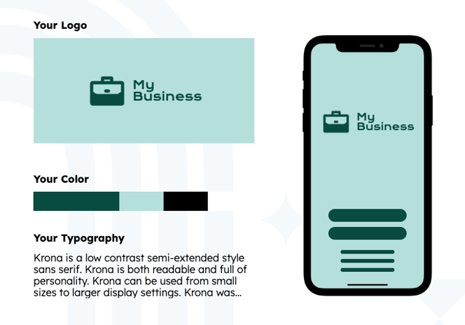
Need A Custom Color Palette For Your Brand?
Choosing the perfect color palette for your brand is a crucial step in creating a captivating and engaging online presence. Your brand’s colors will play a significant role in shaping your identity, conveying your values, and capturing the attention of your target audience.
If this article isn’t giving you enough inspiration to work with, there are a number of online color palette generators to help you out! We’re big fans of Hubspot’s color palette generator pictured below:
7 New Color Schemes for 2022
Taking some more inspiration from fashion and painting company color trends, we’ve curated 7 additional color schemes that are sure to be popular throughout the new year. This year, bright colors and jewel tones are highlighted, as well as a few prominent muted shades (one of them taking the cake as “Color of the Year”). Be sure to draw inspiration from any of these color schemes, and it will definitely help to smarten up, and level up whatever web design project you’re taking on next.
1. Electric Blue – Cleo Website Color Scheme


Source: WWD.com
The color scheme of this money app website almost perfectly reflects some of the colors included in Pantone’s Fashion Color Trend Report for NYFW Spring 2022. In both fashion and web design color trends, you can expect to see plenty of traditional shades (like this classic blue), but also bright and bolder tones that add a sense of revitalization to whatever color scheme they are included in.
Electric Blue: #373e98
Hot Pink: #f16775
Shocking Yellow: #fee36e
Chartreuse-ish: #ceb92c
Darkest Gray: #2a2a2a
2. Hot Orange – Bonjour Paris Website Color Scheme


Source: Stylecaster.com
It seems like one of the “It” colors on the runways of this upcoming year may be this orange shade. So, we’re back with another grayscale palette that includes a bright pop of color, that color being hot orange. This website design shows that bright colors can still come across as luxurious and high-end when used correctly.
Black: #000000
Medium Gray: #565656
Light Gray: #9e9e9e
Hot Orange: #fba92c
White: #FFFFFF
3. Muted Green – The Cool Hunter Website Color Scheme


Source: Sherwin-Williams.com
Better Homes and Gardens curated a list of every “2022 Color of the Year” announced thus far by painting companies. By far, some variation of this muted green color seems to be the most popular shade. This e-commerce website incorporates this popular shade in a very simple way using a background image, showing that your website design doesn’t necessarily have to be overly complicated to look cohesive and professional, especially when using the right colors.
Beige: #c8b7a6
Perriwinkle: #7d94b5
Dusty Rose: #c29591
Maroon Brown: #703f37
Muted Green: #b6c199
4. Lemon Lime – VerticalLoop Website Color Scheme

The citrus-y color scheme gives off a fresh and vibrant feel, and it definitely works to make this web design more exciting, even though the layout is quite simple.
Light Lime: #abd699
Fresh Lemon: #ffe26a
Teal: #75c9b7
Mint: #c7ddcc
Navy: #16123f
5. Jewel Tones – Regent5 Website Color Scheme


Source: Pantone.com
Another major color trend for 2022 is the use of jewel tones, and they are great to include in web designs. Pantone’s Spring/Summer 2022 color report highlights plenty of dynamic jewel tones that give off an expensive vibe. This Regent5 website design also has an expensive feel, communicated by the deep blues and purples incorporated throughout the site.
Mauve: #A96762
Deep Blue: #2F5C8F
Mandarin: #d85c27
Lavender: #b999be
Night Moon: #14365d
6. Sorbet – Mamma Mia Website Color Scheme

Source: Fashionista.com
The popular colors in our post-COVID society are ones that energize and uplift. After the past couple of years of isolation, people want to wear and see shades are soothing and invigorating at the same time. This website color scheme does a great job of including natural/organic shades that are exciting at the same time.
Creme: #f4d8ae
Tangerine: #dc7027
Pistachio: #b6c48e
Peachy: #ea8a81
Black Cherry: #301008
7. Orchid – Gong Website Color Scheme

This Orchid shade is another one that is going to be popular in both fashion and web design in 2022. This color scheme is heavily influenced by technology trends and mobile apps that are already prominent in our society like Spotify and Lyft. This just goes to show the influence that technology tends to have on our preferences, especially post-COVID.
“Orchid flower has an intense, hyper-real and energizing quality that will stand out in both real life and digital settings,” – Joanne Thomas, Head of Content for Coloro
Turquoise: #4cbfa6
Soft Lilac: #f6ebf4
Purple: #482673
Orchid: #ed0b70
Digi Denim: #301008
Color Mood Board for 2022


Hopefully, you’re able to draw a bit of inspiration from these 7 website color schemes and our color mood board for 2022. A new idea can come from anywhere, so remember that it’s okay (and encouraged) to use various forms of design like fashion and interior to influence your web design brainstorming, especially when thinking about color trends.
8 New Color Schemes for 2021
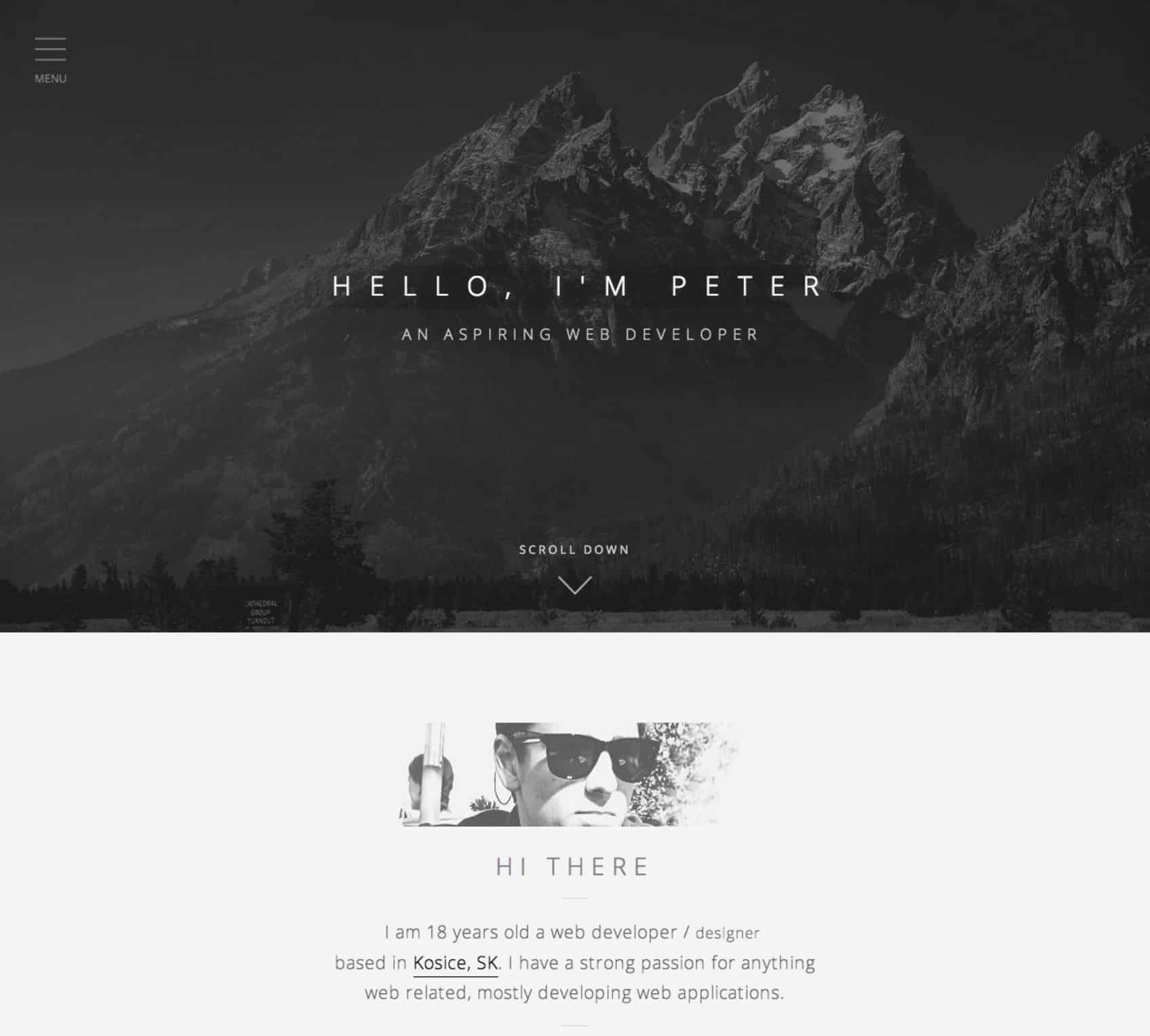
Website color schemes for 2021 – will include a lot of use of photography to solidify the color scheme – a lot of shape cutouts out of white, and a splash of similarly bright colors that draw your eye, but then settle you into deeper – natural colors with the use of earth tones, and deeper hues.
First here are few predictions for color trends in 2021 based on fashion designers and paint companies:

1. Infrared & Purple

Bright Red: #DE354C
Deep Red: #932432
Pure Purple: #3C1874
Purple Tinged Grey: #283747
Cloud: #F3F3F3
2. Earthtone Red and Green

Red Highlight: #B73225
Blue Minded: #004E7C
Maroon 6: #591COB
Grey Water: #5C5F58
Lighter Grey: #DCE1E3
3. Tan + Green Website Color Scheme 2021 by Gatto Web

Makeup Tan: #DDAF94
Blush: #E8CEBF
Complimentary Green: #266150
Dark Highlight: #4F4846
Lightly Off White: #FDF8F5
4. Classic Double Blue Color Scheme

Dark Blue: #12232E
Lighter Blue: #007CC7
Lightest Blue: #4DA8DA
Shadow of Dark Blue: #203647
Shadow of Light Blue: #EEFBFB
5. Greyscale + One (Yellow) 2021 Website Color Scheme

Blackish: #202020
Dark Grey: #3F3F3F
Medium Grey: #707070
Egg Yellow: #FFD6C
White: #FFFFFF
6. Greenery + Gradients Website Color Scheme 2021 by Anna Senkova

Dark Green: #164A41
Medium Green: #4D774E
Light Green: #9DC88D
Natural Yellow: #F1B24A
White: #FFFFFF
7. Greenery + Pearl Website Color Scheme 2021 by Delightful Designs

Olive: #A3BCB6
Green Leaf: #39603D
Brown Grey: #3C403D
Tanly: #DADED4
White: #FFFFFF
Color Mood Board for 2021


I hope you enjoyed these website color schemes, and this mood board for 2021 website color schemes. I know it was super fun putting it together – and although it’s low word count, it took a good amount of time to curate.
Here’s the original post! Website Color Schemes 2020-2021
Web design can be fun!
Especially when you have the right color scheme.
That’s why we’ve curated the absolute best of the best 50 epic color schemes from the far reaches of Dribbble, Awwwards, Pinterest, Behance, and a couple of great blogs.
After your done finding the web color palette of your dreams – check out our Analytics Basics, SEO Basics, and our Modern Fonts articles to continue making your website awesome. And, of course, let us know if we can ever help you with our small business website design services!
Summer 2020 Update – 13 New Website Color Schemes for 2020
1. Minimal Colors, Soft Beach by Duminda Perera

Bright blue: #51e2f5
Blue Green: #9df9ef
Dusty White: #edf756
Pink Sand: #ffa8B6
Dark Sand: #a28089
2. Minimal Colors – Purple 90’s Color Scheme by Duminda Perera

Ice Cold: #a0d2eb
Freeze Purple: #e5eaf5
Medium Purple: #d0bdf4
Purple Pain: #8458B3
Heavy Purple: #a28089
3. Bright Power by Duminda Perera

Yass Queen: #ff1d58
Sister Sister: #f75990
Crown Yellow: #fff685
Blue Light: #00DDFF
Brutal Blue: #0049B7
4. Rethink. Color Scheme by Sajon

Brightly Orange: #ff1e00
Dimly Blue: #e8f9fd
Alert/Highlight Green: #59ce8f
5. Global Charity Website Color Schemes by Cuberto

Brightly Orange Number 2: #f43a09
Grandpa Orange: #ffb766
Grey Blue Green: #c2edda
Live Green: #68d388
6. Banking and Finance Website Color Schemes by Juliene Renvoy

Pinky: #fbe3e8
Blue Greeny: #5cbdb9
Teeny Greeny: #ebf6f5
7. Intense green, blue, and red color scheme

Bright Green: #beef00
Electric Red: #ff0028
Deep Green: #657a00
Power Blue: #1400c6
8. White space, tan, purple, yellow color website scheme

Background Tan: #fceed1
Purple-y: #7d3cff
Yellow Gloves: #f2d53c
Redhead: #c80e13
9. Deep blue and tan – color palette

Sand Tan: #e1b382
Sand Tan Shadow: #c89666
Night Blue: #2d545e
Night Blue Shadow: #12343b
10.Tan, pink and red color scheme

Ragin Beige: #fff5d7
Coral Pink: #ff5e6c
Sleuthe Yellow: #feb300
Pink Leaf: #ffaaab
11. Pink, Green, and Purple illustration web design color scheme

Grassy Green: #9bc400
Purple Mountains Majesty: #8076a3
Misty Mountain Pink: #f9c5bd
Factory Stone Purple: #7c677f
12. Bright and colorful – scheme for 2020

Green Treeline: #478559
Purple baseline: #161748
Pink highlight: #f95d9b
Bluewater lowlight: #39a0ca
13. Yellow, Red/Pink/Orange – Bright Scheme

Yellow Background: #ffde22
Pink / Red Circle: #ff414e
Orange Circle: #ff8928
White Layover: #ffffff
2019 Website Color Schemes:
1. 70’s Inspired – Modern Color Palette

Mountain Shadow Blue: #101357
Old Makeup Pink: #fea49f
Goldenrod Yellow: #fbaf08
Bluebell Light Blue: #00a0a0
Bold 2019 Green: #007f4f
2. Lightning Blue Purple – Simple Web Color Palette

Lightning Blue: #51d0de
Lightning Purple: #bf4aa8
Brain Wrinkle White: #d9d9d9
3. Metallic Blue, Purple, Red – Website Color Palette

Blue Popsicle: #0f2862
Redline: #9e363a
Purple Shadow: #091f36
Grey Blue Leaf: #4f5f76
4. Apricot Avalanche – Web Design Color Schemes

Blueberry: #6B7A8F
Apricot: #F7882F
Citrus: #F7C331
Apple Core: #DCC7AA
5. Strong Contrast and Trustworthy

Left Blue: #1561ad
Right Blue- Muted: #1c77ac
Blue-Green: #1dbab4
Red-Orange: #fc5226
6. Classic Red Gold Website Color Palette

Redder than you: #ff3a22
Goldi-lots: #c7af6b
Darker Gold: #a4893d
Silver Tongue: #628078
7. Subtle and Succulent Web Color Scheme

Barely Green: #acb7ae
The Brown-shirts: #82716e
Tan Blonde: #e4decd
Blondey: #c2b490
8. Photographic Memory

Green Mountain: #3d7c47
Blue Mountain: #09868b
Light Blue Backdrop: #76c1d4
Barely Gray Edge: #f7f7f7
9. Futuristic Lightbrite

Grey silver: #bccbde
Lightsaber Blue:#c2dde6
Purple: #431c5d
Orange: #e05915
Yellowbrite: #cdd422
10. Trapper Keeper Red & Purple

Painful Red: #eb1736
35 Years Old Purple: #5252d4
Lighter purple on the gradient: #7575dd
Shadow Purple Red: #781a44
11. Easter Egg Sandwich

Green: #8bf0ba
Ironic Blues: #0e0fed
Blue Underling: #94f0f1
Pinky Ring: #f2b1d8
Egg Yellows: #ffdc6a
Looking a savvy web design team? Web design niches we serve: Plumbing, HVAC, Construction and Roofing. From HVAC leads to construction contractor leads – we share all of the ideas on our blog!
The Original set of website color schemes:
1. Intellectual Nonchalance

Light Blue Green: #6ed3cf
Soft Purple: #9068be
Tasty Eighties Grey: #e1e8f0
Rich Red: #e62739
Found on Trendy Web Color Palettes from Awwwards
2. Extra Snug

French Laundry Blue: #3a4660
Comfortably Tan: #c9af98
Peachy Kreme: #ed8a63
Brown Bonnet: #845007
Found on Desi Shirt by Filip Dueskau on Behance
3. Dark Horse

Are ya yellow?!: #feda6a
Silver Fox: #d4d4dc
Deep Matte Grey: #393f4d
Dark Slate: #1d1e22
Found on Vintage Rides Concept by Creativa Studio on Dribbble
4. Sleepy Green Streaks

Simpler Lime Green: #7dce94
Scuffed Dark Grey: #3d3d3f
Vanilla Grey: #f6f5f3
White-ish: #f9f8fd
Found on The Jungle Book Website by Watson D/G for Disney
5. Precious Metals

Rose Gold: #bd8c7d
Soft Gold: #d1bfa7
Silver: #8e8e90
Onyx: #49494b
Found on KAE Branding by Socio Design
6. European Bodies

Yellow Hand: #fbf579
Lonely Blue: #005995
Stationary Pink Red: #fa625f
Purpled: #600473
Found on Website Inspiration by Mind Sparkle Mag
7. Simple Brilliant Accents

Red Overlaid: #cd5554
Photographed Brown: #91684a
Algae Green: #00c07f
Heritage Blue: #313d4b
Found on Website Inspiration by Mind Sparkle Mag
Still hungry for more? Check out the amazingness on Mind Spark Mag and page through the awesome examples. Such a great curation of modern, often Swiss-inspired web design.
Part Two – Observations on interplay and color in context
Elements of color are essential not only in the way they pair with other complementary shades but also in the quantity and placement in relationship to those other colors and in how it relates to other patterns and photographic elements next to it and elsewhere on the website. In this section, I will share/curate websites with beautiful color schemes, hexadecimal codes, and just a brief note about why color being used works in context as well.
8. Blue Red

Deep Red: #b11a21 – In an overlay, juxtaposed against flat blue, the photographic background gives depth.
Lighter Red: #e0474c – The smiling face coming through the red, makes it feel striking.
Blue Beans: #7acfd6 – The flat blue provides a contrast to the photo behind the red.
Light Classy Grey: #f1f0ee – Simple light grey is used to provide depth behind a later photographic section, with white below.
Found on Website Inspiration by Mind Sparkle Mag
9. Sunny and Calm

Morning Sky: #CAE4DB – Never underestimate a color palette created by a photograph to set the tone of your design.
Honey: #DCAE1D – In this case, the palette is set with the photo and then echoed in the subtitle.
Cerulean: #00303F – Cerulean is incredibly classy as a black or dark grey alternative if used consistently throughout.
Mist: #7A9D96 – This clean, natural color is established in the photo but could be used on a lower full-width block or buttons as well.
Found on Inspiring Website Color Schemes by Canva
9. Dark and Orange

Dark Grey: #393939 – Dark designs take a little bit more fore-thought but can provide tons of contrast if used well.
Deep Orange: #FF5A09 – With different shades of oranges, there is depth and gradient, without venturing into totally new colors.
Light Orange: #ec7f37 – Utilizing illustrative elements, requires a bit of flexibility for the natural lightness and darkness to contour objects.
Orange Yellow: #be4f0c – Using on color over on the color wheel can keep the palette looking classy, bold, and restrained.
Found on Great Color Schemes by One Extra Pixel
10. Squeaky

Fresh: #4ABDAC – Once again the color overlaid over the photographic elements provides a classy modern touch
Vermillion: #FC4A1A – A figure in the foreground is worked into the context, still paying attention to how it complements the overall structure of the design. In fact, one might even be able to surmise that the design was down around this figure.
Sunshine: #F7B733 – The Yellow provides only a juxtaposed call to action and highlights important parts
Clean: #DFDCE3 – Clean grey, utilized in the photograph, keeps the structure un-encumbered by more colors or patterns in these sharp headshots.
Found on Inspiring Website Color Schemes by Canva
11. Basic blue-green

Ol’ trusty blue: #368cbf – Blue wins for trust in color psychology, but make sure it’s a tasteful hue, as some blues are too out of the box. Just like my art teacher said with paints, you should always mix them before applying to canvas, lest you get something that looks like you just slapped the colors out of the box.
Accent color green: #7ebc59 – Corporate Blue + Eco-conscious green = Every website ever. But don’t overlook the use of common color schemes just because their common. Wield familiar colors together when it serves your purpose of feeling trustworthy.
Dark Slate: #33363b – Breaking up white space with a darker header, footer, or full-width sections provides relief from things that are too repetitive.
Light grey: #eaeaea – This truly is one of the most common color schemes around the website, particularly for technology companies. Are you sick of it yet? I like it.
Found on Free awesome WordPress Themes by ColorLib
The vital part of this section is a reminder that colors don’t live in a vacuum. How they relate to each other is complex, and pairing them not only with other colors that complement them but in degrees and quantities that work well together is important. When I show that orange and yellow are working well together, always keep in mind the context and how much of each are present. There might be a tiny sliver of yellow, so it’s not just that they work well, but how much of each and where.
Part Three – On the absence of color and well done monochromatic color schemes
Taking color out of the mix entirely – for certain parts of a website – or composition, in general, can be a classy yet straightforward way to increase the seriousness, or elevate the intensity of a piece. This is evidenced by how we feel when we see a black and white photo; either we sense certain self-importance or appreciate the simplicity and recognize an air of positive sophistication.
This concept and tone are also present in websites where only one color and various hues of that color are used, allowing the eyes to rest and revel in all that is blue, or all that is green, or 3 shades of purple. I will also include some monochromatic + 1 color schemes which mean black, white, any shades of gray plus one other color, and it’s shaded. The same general principles are at play in each of these scenarios. By eliminating all other colors except a select few, you can actually enhance the way the few remaining colors play together and increase the dramatic tension of the website – if it’s done well.
In the end – the website design alone won’t sell more stuff if that’s your goal. Combine these high-end styles with Search Engine Optimization to get more leads.
12. Stark Contrast

Slate: #262626 – Repeat after me, all grays are not equal
Secondhand Grey: #3f3f3f
Whitish: #f5f5f5 – Repeat after me, all whites are not equal
Light grey: #dcdcdc
Found on One Page Love, created by Peter Toth
13. True Black and white + Photography

Black: #000000
White: #ffffff
Found on Web Design Ledger – 20 Beautiful Portfolio’s, Work by Michael Schmid
14. Goldifox

Golden wheat: #a39274
Soft Wheat: #dfd8c8
Deep gray: #252523
This color scheme, of course, also demonstrates what a great photo can do for the overall look of your site if juxtaposed with the strong contrast of the flat color elements.
15. Minty refreshed

Mint: #4cb69f
Touch of Grey: #f5f5f5
Deep purple: #201d3a – Not quite B&W+1 – Hint of purple in the corner of the photograph
Found at Dapper Ink by Joel Reid on Dribbble
16. Blue + White

Optimism Blue: #269ccc
Blue Algae: #9ed2c5
Flat Grey: #7b7b7b
Found on fltdsgn.com
And a couple more greyscale websites to make it abundantly clear that greyscale can be extremely beautiful.
16. Experimental Simple Photography – Square separations

Found on InspirationDE by Sam Thies
17. The floating object, angled section separation, simple editorial typography

Found on flatdsgn.com by Roland and ‘We Ain’t Plastic’
18. The rectangle around letters, creative letter blocking

Found on Behance, by Diana Polar
This whole section calls to mind how much we overlook the use of negative space in design and rely instead on our ability to fill space. Leaving white space and filling only a portion of it intentionally establishes a sophistication in design, and now crowded frills can beat. Pair this sensibility with a tasteful choice of typographic elements and well-crafted photographic assets to make anything look high-end.
Part Four – On the interplay of typography and color
Typography, color, layout. None of these elements stand alone in any composition, and to talk about one without the other leaves an incomplete picture. Always be paying attention to how the character of your web design color scheme plays with your typographical elements. Fonts should be hand-selected for their attributes, not selected haphazardly.
19. Charcoal Black, Gold and lot’s of white space

Golden top: #d8ab4e
Golden bottom: #b48c36
Charcoal Black: #040404
19B. Font Pairings to compliment the color Choices – Gin Rough and Amiri
Gin Rough – by Fort Foundry, Available on MyFonts – By taking the high-end feeling gold gradient and pairing it with very intentional shaped typographic elements, the designers of this site juxtaposed the rugged and elegant.
Amiri Rough – Available through Google Fonts – Looks gorgeous as a testimonial or call out quote.

Found on Web Design Inspiration for Gentlemen Barber Clubs (You need to see the full site)
20. Clean Khaki Red

Cotton Red: #c53211
Clean Deep Grey: #2e3830
Khaki: #e6dbc9
20B. Font Pairings to compliment the color Choices – Futura Bold and Museo Slab
Futura Bold – is as classic as it is simple. Common similar fonts like Gotham Black, Montserrat, or Proxima Nova can allow you a similar but different flavor. Still, Futura Bold will be useful for a lot of situations – and plays well in this simple red, gray, tan color scheme as uppercase titles.

Museo Slab – As both the 100 weight in the blockquote above and the paragraph text (font-weight: 400), Museo Slab provides readability, whether big and small. Futura, Museo Slab over these comfortably simple colors feel not necessarily classic, but modern and original. The restraint in both color choices and typography leads to a very cohesive feel that leaves the whole website feeling integrated and branded.
21. Hip Modern Pastels


Pastel Peach: #dea6af
Sky Blue: #8cbcd0
Pastel Pink: #e6dbc9
21B. Font Pairing to complement the color Choices – Calibre – the European Design Ketchup
Calibre – I love the look that many modern European websites achieve with this mature, swiss feeling typeface. It’s going to see a lot more use in America before it gets overdone here. The no-frills application below shows you the confidence with which a lot of European designers are using it. Impeccably played.

The design found on CSS Design Awards – Buy Calibre typeface
No matter what colors you use, your website will be better if it uses a very well thought out typeface or two. Finding a balance between the color and the fonts is not necessarily scientific – it requires a certain poetic association, but that doesn’t mean it’s entirely subjective. The colors can either be diametrically opposed to the personality/personalities of the typeface(s), or be in direct alignment with them.
A few words of encouragement
Using descriptive words like ‘masculine,’ ‘feminine,’ ‘rugged,’ ‘classic,’ ‘clean,’ ‘modern,’ and ‘expressive,’ can help you talk about color schemes and typefaces with your clients and others working on your design with you. It’s important not to get caught up in the semantics – or meanings of the words – too strictly. Rather, use them as they are useful to you and discard them as soon as they become contentious.
The crucial piece is that your designs serve the purpose that they are intended for – that they are effective. By taking some time to start projects with a color scheme that meets the emotional needs of the prime demographic, you are setting them up for success. At it’s most basic level, that means not making a website for men purple as it’s statistically their least preferred color. You also wouldn’t want to make a medical website black as it connotates death, or giving a very light and airy yellow color scheme for a serious subject lest it insinuates frivolity.
At it’s most acute, intention in a web design color scheme means communicating the brand voice, the emotional appeal, occasionally being open to things previously learned by others (green for an environmental project, blue for a technology project, red for sports and aggression,) and following your instinct as you dive headfirst into what would truly speak to this particular market. The greatest designers were all guessing, too, and took a stab at something new. Jump in, soak up what’s already out there in the particular market the product or service is in. Then, look at the most visually appealing and effective designs in all markets and try your hand. After you’ve tried some pre-mixed hex color schemes listed above or elsewhere – mix up your own.
[bctt tweet=”“The greatest designers were all guessing too and took a stab at something new.””]
Recognize your hidden powers, trust your creative instincts, and get your hands dirty.
Part Five – What is a modern color palette?
Well, I’ll tell you one thing a modern color palette is not using super simple versions of the colors we traditionally think of: blue, green, yellow, etc. Regardless of if you can make simple colors look good together or not – it seems unsophisticated and relatively bland. I remember my painting teacher in college saying always to mix your paints with intention at the beginning of a session – because people who just squeeze them out of a tube are going to find the look of their painting drab indeed.
What we want is a modern color palette that appeals to the refined tastes of today’s consumer. It can be bold and fresh, or earthy and rusty – but it should never look haphazard.
22. A Sleek Modern Color Palette

Dark Blue/Purple: #111c30
Dark Pink Makeup: #9a4d55
Comfortable Couch Beige: #80756b
23. A Subdued Modern Color Palette

Tiny Sweet Blue: #b5e9e9
Creamy Light Tan: #fef6dd
Pinkie Pie: #ffe1d0
Yellow Horse: #fff1b5
Green Thumb: #dcf3d0
24. A Fresh Modern Color Palette
Deep Purple: #1d1145
Trapper Keeper Green: #0db4b9
Pink Boot: #f2a1a1
Modern Pink Backpack: #e76d89
25. An Earthy Modern Color Palette

Red branches: #de493c
Green Trees: #608074
Blue/Green Mist: #daefd9
26. A Rusted Modern Color Palette
Deep rusted red: #c1432e
Silver head-dress: #4b6777
Rusted Gold: #ce9e62
Black for Contrast: #2c2c2c
5 of the Best Website Color Scheme Generators to Get You Started
There are obviously a lot of choices to choose from when it comes to the colors you choose for your website. Lucky for you, some great online color scheme generators can help you find the perfect fit for you.
Flat UI Colors

With an easy click-to-copy feature, you can paste the HEX codes the existing color schemes they already have available.
Color Supply

With the option to choose from complementary, analogous, triad, split-compliment, and square color combinations, this fun tool allows you to explore numerous color options and helpful images below the color wheel to help you visualize each color combo.
Coolers

If you want to get extremely detail-oriented with your color schemes, then check out the Cooler app, which allows you to get very technical with your colors for a highly-customizable web color scheme.
Palette Generator

The Palette Generator is an awesome way to help turn your favorite landscape, cityscape, or any photo into a color scheme. Easily upload a picture, and this tool does the rest.
Paletton

Another tool that allows for highly customizable colors; Paletton is a great app for expanding your color scheme repertoire.
62 percent of businesses polled said they believe a web site should be re-designed every 2-3 years! Source: Hook Agency
Frequently Asked Questions about Website Color Schemes
What is the best color for a website?
Blue is definitely the safest choice since it has the highest number of people saying it’s there favorite at 35%. However – clearly, if your competitors are all using blue, it might make sense to ‘differentiate’ your offering and brand. Your brand colors should be appealing, and ‘white space’ is an important part of that. Make sure you give space to the elements you do include, have a contrast between text and backgrounds, and don’t overwhelm the visitor – trying to be too flashy or being novel just for the sake of novelty.
How many colors should a website have?
Consider that 51% of brands choose monochrome logos, 39% use two colors, and only 19% of companies choose full-color logos. Besides photographs, 1, 2, and 3 color websites seem to be easier to pull off well than trying to make a website with a rainbow of colors. That being said – if you have a professional designer, clearly Microsoft and Google believe there’s a benefit of working with more colors as they both use at least 4 solid colors in their design.
Why might I consider hiring a professional website designer?
Choosing a color scheme is tricky – but there are far more heavy-duty problems in a website design that may benefit from the help of a seasoned designer. Professional web designers have tried 100’s of things and realized what methods do and don’t work – ideally, if you work with a team like Hook Agency they’ve also A/B tested websites, made changes based on Analytics, and know how to make your website easy to find on Google.
You’ve uncovered a secret hatch into the inner workings of the internet! 😉
We know how to do amazing things like this very cool FAQ add-on to our listing here on Google. We know how to wield your website on Google through a practice called ‘Search Engine Optimization’ – so, beyond website color schemes, we know how to DRIVE BUSINESS from Google traffic. If you’d like to work with a professional web design team – send us a message now at tracy@hookagency.com!
Another tactic we use to optimize rankings is a little something called inter-linking. So if you’ve ever wondered who the sexiest man in MN is, or wanted to read a plumber SEO guide, give them a read!